

Responsive STR Website Design: 10 Things That Actually Drive Bookings
- Chase Gillmore

- Apr 20
- 21 min read

Responsive STR website design refers to building a vacation rental website that automatically adapts its layout, images, and booking functionality to any screen size, from a 27-inch desktop monitor to a 4-inch phone. According to StatCounter's global platform data, over 60% of website visits now happen on mobile devices. For short-term rental operators, that number is not background context. It is the single most important design constraint you are working with.
Responsive STR website design requires three technical components: fluid grids, flexible images, and CSS media queries, as formally defined by web designer Ethan Marcotte.
Over 60% of website visits happen on mobile devices, according to StatCounter data cited by Pipedrive in 2026, making mobile-first design the baseline for any STR direct booking site.
According to Avantio, pages that load in under 3 seconds reduce bounce rates and improve local SEO, directly affecting how many guests find your property through organic search.
STR-specific responsive design challenges, including calendar widgets, booking engine behavior, and photo gallery performance on slow connections, are different from general web design concerns and require targeted solutions.
A clunky website interface can cost STR operators 10-30% in fees per booking when frustrated guests abandon the direct booking site and switch to an OTA instead, per EHL Insights.
Platforms built specifically for vacation rentals, such as CraftedStays, report a 35% average conversion rate increase when operators switch from generic builders to purpose-built STR solutions.
What Is Responsive Design and Why Does It Matter for Your STR Site?
Responsive web design is a development approach in which a website's layout, content, and functionality automatically adjust to match the screen size and resolution of the device a visitor is using. Ethan Marcotte, the web designer who formally coined the term, defined it as requiring three components working together: CSS media queries, fluid grids, and flexible visuals. Without all three, a site may display differently on mobile but is not truly responsive.
For short-term rental operators, the stakes are unusually high. Your website is your only commission-free booking channel. When it breaks on a guest's phone, that guest does not email you to report the bug. They open Airbnb and book there instead, costing you a platform fee on a booking you already had within reach.
According to EHL Insights, a clunky website interface can cost hospitality operators 10-30% in fees per booking as guests abandon direct booking sites in favor of OTAs. That figure compounds quickly across a full calendar year. A property generating $80,000 annually in bookings, with even 20% of direct booking attempts abandoned due to poor mobile UX, loses significant revenue to preventable platform commissions. This is the hidden cost that most general web design articles never address.

How Do Fluid Grids, Flexible Images, and Media Queries Work Together?
The three technical pillars of responsive design, fluid grids, flexible images, and CSS media queries, function as a coordinated system. Fluid grids use percentage-based column widths rather than fixed pixel measurements, so content reflows naturally as the viewport narrows. Flexible images scale within their parent containers using max-width: 100% with height: auto, preventing photos from overflowing on small screens while also preventing them from upscaling beyond their original resolution. Media queries apply different CSS rules at specific breakpoints, allowing you to fundamentally restructure the layout at key viewport widths.
In practice, real-world responsive sites set breakpoints at predictable thresholds. Based on publicly documented examples, Plantible Foods uses breakpoints at exactly 992, 768, and 479 pixels to transition from desktop to tablet to mobile. Hello Bello's website switches from a sticky sidebar navigation to a top jump-menu at a 767-pixel max-width breakpoint. The History of Animation site adjusts headline line height from 52 pixels above 479 pixels wide to 40 pixels below it. These are not arbitrary numbers. They correspond to the most common device viewport widths for tablets and phones in 2026.
For STR websites specifically, fluid grids matter most in the photo gallery and the booking summary panel. Both of these elements carry a disproportionate share of booking decisions. A gallery that forces horizontal scrolling on mobile, or a booking panel that stacks awkwardly and hides the total price, creates friction exactly where your guest's intent to book is at its peak.
What Are the STR-Specific Responsive Design Requirements General Articles Miss?
STR-specific responsive design requirements differ fundamentally from general website design concerns because vacation rental sites combine a visual showcase, a real-time inventory tool, and a transactional booking engine in a single interface. Each of these three functions creates its own mobile UX challenge that general web design articles consistently ignore.
Availability Calendar Responsiveness
Standard date-picker widgets built for desktop interfaces often render at fixed pixel widths that exceed a phone's viewport. The result: guests pinch and zoom to interact with your calendar, or worse, the calendar renders but the tap targets are too small to use accurately. Booking intent drops sharply at this friction point. Your calendar widget needs to either reformat into a vertical single-month view on mobile or adopt a purpose-built touch-friendly date picker that fills the screen width and uses adequately sized tap targets, at minimum 44x44 pixels per Apple's Human Interface Guidelines.
Booking Engine Behavior Across Devices
Dropbox offers an instructive example from outside the STR industry: their desktop version shows a "Sign up for free" CTA while mobile and tablet versions show "Find your plan" instead. This is not a technical coincidence. It reflects researched differences in user intent by device. STR operators should apply the same logic. A desktop guest may browse photos, read amenities, and compare dates at leisure. A mobile guest is often mid-trip-planning, wants to confirm availability fast, and needs a prominent booking button within the first viewport scroll. Your responsive design should serve those different behavioral patterns, not deliver the same interface at a smaller size.
Photo Gallery Performance on Slow Mobile Connections
High-resolution property photography is your strongest conversion asset. It is also the most common source of catastrophic mobile load speed failures. A gallery of ten 4MB images that loads instantly on a home broadband connection may time out on an LTE connection with typical variability. The HTML <picture> element solves this by serving different image files depending on browser window width and using media attributes to deliver appropriately sized images. A visitor on a phone at 600 pixels wide should receive a compressed 800-pixel-wide image, not a 3,000-pixel full-resolution file that loads in 12 seconds and drives them off the page.
At Maverick STR, we see this exact issue across new website audits: operators invest in professional photography and then serve those raw files uncompressed to every device. Tools like TinyPNG handle compression at the file level, while the <picture> element handles responsive delivery at the code level. Both are necessary.
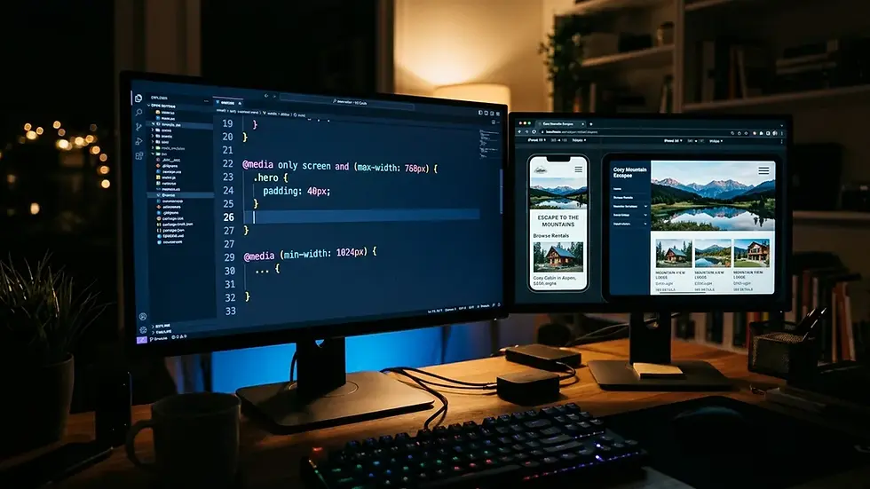
How Does Responsive Design Affect Your STR Site's SEO and Direct Booking Visibility?
Responsive STR website design directly affects search visibility because Google uses mobile-first indexing, meaning Google's crawlers evaluate and rank your website based on its mobile version, not its desktop version. If your mobile site has stripped-down content, broken navigation, or missing schema markup compared to your desktop version, your rankings suffer regardless of how polished the desktop experience looks. This is especially consequential for local vacation rental search, where guests use queries like "Nashville vacation rental with hot tub" or "Charleston SC direct booking" that carry strong local intent. If you manage Nashville vacation rental properties, a non-responsive site actively suppresses your visibility in exactly those searches.
According to Avantio's 2026 research, pages that load in under 3 seconds reduce bounce rates and improve local SEO. Google's Core Web Vitals, specifically Largest Contentful Paint (LCP), Cumulative Layout Shift (CLS), and Interaction to Next Paint (INP), are direct ranking factors. A non-responsive site with large unoptimized images will fail LCP benchmarks. A site where content reflows awkwardly as it loads on mobile will generate CLS scores that suppress rankings.
The practical implication: your responsive design decisions are also SEO decisions. Every oversized hero image, every non-reordering content block, and every fixed-width booking widget is simultaneously a user experience failure and a search ranking penalty. For STR operators building direct booking websites, these technical details are not optional extras. They determine whether Google surfaces your site to guests at all.
Structured data also behaves differently on responsive versus non-responsive sites. A site with inconsistent mobile rendering may cause Googlebot to extract incomplete or mismatched schema, reducing your eligibility for rich results like rental availability in search cards. For further depth on this intersection, the vacation rental SEO discipline covers how technical site architecture drives organic traffic to direct booking pages.
What Is the Mobile-First Design Approach and Should You Use It?
Mobile-first design is a development philosophy in which you design and build the mobile layout of a website first, then progressively add complexity for larger screen sizes, rather than designing for desktop and scaling down. The practical difference is significant. Desktop-first responsive design often involves removing or hiding elements for smaller screens, which creates inconsistencies and missed mobile optimizations. Mobile-first design forces you to decide what is genuinely essential for a booking decision before adding supplementary content for larger viewports.
For STR direct booking sites, mobile-first is the correct approach in 2026. More than half of all internet traffic comes from mobile devices, per Statista's global traffic data. Your booking funnel, your photo gallery, your availability calendar, and your property description all need to work flawlessly at 375 pixels wide before you optimize for a 1440-pixel widescreen monitor.
But mobile-first does not mean mobile-only. A guest researching a large group rental like an 8-bedroom bachelorette property will often browse initial options on their phone during a commute, then return on a laptop to confirm details and complete the booking. Your site needs to handle both sessions gracefully, with a consistent experience that does not require the guest to relearn your navigation between devices.
What Are the 7 Design Elements That Actually Convert Browsers Into Bookers?
Conversion-optimized responsive STR website design requires more than making content fit a small screen. Seven specific design elements, when implemented correctly across all device sizes, directly drive the transition from browsing to booking.
1. A Persistent, Prominent Booking CTA
Your book-now button should be visible without scrolling on every device. On desktop, a sticky sidebar booking panel works well. On mobile, a fixed bottom bar with a single "Check Availability" button is more effective than a panel that competes with the page content. Dropbox's device-specific CTA strategy, where mobile shows a different action than desktop, demonstrates that leading platforms optimize CTA placement and language by device, not just by screen size.
2. A Gallery That Loads Fast and Scrolls Easily
Property photos are the primary decision driver for most guests. On mobile, a swipeable full-screen gallery with lazy loading outperforms a static grid that loads all images at once. Use the <picture> HTML element to serve compressed images to small screens and full-resolution versions to large screens. Dribbble's responsive grid, which collapses from a 4x3 layout on desktop to a single column on mobile, illustrates the pattern: prioritize viewing area over visual complexity on small screens.
3. Touch-Friendly Navigation
Hamburger menus are the standard mobile navigation pattern for a reason. They clear the viewport for content while keeping navigation accessible. But the hamburger icon itself must be large enough to tap without frustration. Aim for at least 44x44 pixels for any tappable element. Avoid hover-state navigation menus entirely on mobile, since hover does not exist on touchscreens.
4. A Functional, Touch-Optimized Calendar
This is where most STR sites fail. If your availability calendar requires precise tapping on small date cells, guests will give up. Use a calendar widget built specifically for touch interfaces, with large date targets, clear unavailable-date styling, and a month-view that fills the full screen width on phones.
5. Fast Load Speed Across Connections
According to Avantio's 2026 data, pages need to load in under 3 seconds to reduce bounce rate and preserve local SEO rankings. Compress images before upload, use a content delivery network (CDN) to serve assets from geographically close servers, and minimize render-blocking JavaScript. Every second of additional load time costs you bookings, especially on mobile where connection speed is less consistent than home broadband.
6. Legible Typography at All Sizes
Responsive typography uses relative units like rem, em, and viewport width units (vw) rather than fixed pixel font sizes. This allows text to scale proportionally with the screen. The practical test: your property description should be readable without zooming on a 375-pixel-wide phone screen. If a guest needs to pinch and zoom to read your amenities list, you are losing them before they ever reach the booking form.
7. A Checkout Flow With Minimal Steps
A responsive booking engine should reduce friction at every step. Guest name, dates, and payment in three screens beats a six-step checkout flow that works on desktop but requires excessive scrolling on mobile. Platforms like CraftedStays, built specifically for STR operators, are designed around this booking funnel optimization and report a 35% average conversion rate increase for operators switching from generic website builders.
How Do You Test a Responsive STR Website Across Devices?
Testing responsive STR website design requires a combination of automated tools and manual device testing to catch the full range of issues that affect booking performance. No single method catches everything.
Start with Google's built-in device emulation in Chrome DevTools. Open any page, right-click, select "Inspect," and use the device toolbar to preview your site at standard viewport widths including iPhone 12 (390 pixels), iPad (768 pixels), and standard laptop (1280 pixels). This catches major layout breaks instantly. For Core Web Vitals, use Google's PageSpeed Insights tool, which provides both mobile and desktop scores separately and identifies specific elements failing LCP, CLS, and INP thresholds.
For deeper technical audits, Screaming Frog SEO Spider crawls your entire site and flags broken elements, oversized images, and missing viewport meta tags at scale. The viewport meta tag itself, <meta name='viewport' content='width=device-width, initial-scale=1.0'>, is the foundational HTML requirement for responsive behavior. Without it, mobile browsers render your page at a default desktop width and shrink it to fit the screen, producing the zoomed-out, unreadable layout that drives guests straight back to Airbnb.
Manual testing on real devices catches what emulators miss: actual tap accuracy on physical touch targets, real-world scroll behavior, and the visual rendering differences between browsers. Test on at least one Android device (Chrome) and one iOS device (Safari), since rendering engines differ between them. Pay particular attention to how your booking calendar and checkout form behave on each.

What Are the Most Common Responsive Design Mistakes STR Operators Make?
The most common responsive design mistakes in the vacation rental industry are distinct from general web design errors. They cluster around the specific functional requirements of an STR booking experience.
Oversized, uncompressed hero images. A 6MB full-bleed photo of a hot tub looks gorgeous in a design mockup and catastrophic on a mobile load speed audit. Compress every hero image to under 200KB for mobile delivery and use the <picture> element to serve the full-resolution version only to large-viewport devices.
Fixed-width booking widgets. Many popular booking engines embed as fixed-width iframes that overflow the mobile viewport. If your booking widget requires horizontal scrolling to use on a phone, you have a critical conversion failure at the most important point in your guest's journey. Replace or configure the widget specifically for mobile-first display.
Non-tappable buttons and links. Booking buttons sized for a mouse cursor are too small for thumbs. Any tappable element under 44x44 pixels will generate accidental taps or missed taps, both of which create frustration. Google's PageSpeed Insights flags undersized tap targets directly in its mobile audit.
Ignoring the viewport meta tag. This is the most foundational responsive design requirement and the most commonly missing element on DIY-built STR sites. Without it, mobile browsers cannot render your responsive CSS correctly.
Desktop-only contact or inquiry forms. Multi-column forms designed for a wide desktop layout collapse into unusable overlapping fields on mobile. Every contact form and inquiry form on your site needs to be tested specifically at 375 pixels wide.
PMS sync display inconsistencies. When your property management system pushes availability data to your website, the display of that data, particularly blocked dates and pricing overlays in your calendar, must be tested across devices. PMS sync issues that only appear on mobile are common and invisible to operators who only test on desktop.
What Is the Comparative Impact of Responsive Design on Booking Revenue?
The revenue impact of responsive STR website design is measurable at multiple points in the booking funnel. Conversion data from purpose-built STR platforms provides the clearest benchmarks currently available.
Design Condition | Metric | Source |
Non-responsive or poorly optimized site | 10-30% of bookings lost to OTA switching due to UX friction | EHL Insights, 2026 |
Pages loading over 3 seconds | Increased bounce rate, reduced local SEO rankings | Avantio, 2026 |
Switch from generic builder to STR-specific platform | 35% average conversion rate increase | CraftedStays internal data |
New property on optimized direct booking site | 40% direct booking rate in first month (case study: Boutique Host Launch) | CraftedStays case study |
Existing operator switching to responsive platform | 75% conversion rate increase (case study: OC Adventure Stays) | CraftedStays case study |
Optimized direct booking website (general) | 100% of booking revenue retained (no OTA commission) | Avantio, 2026 |
The OC Adventure Stays result, a 75% increase in conversion rates after switching to a responsive purpose-built platform and reaching 35% direct bookings after one year, represents an exceptional outcome. But even modest improvements in mobile conversion have outsized impact. A property generating 100 annual bookings with an average nightly rate of $250 and an average stay of 3 nights earns $75,000. Recovering 20% of previously abandoned mobile bookings by fixing responsive design issues adds $15,000 in commission-free revenue annually. That math repeats every year the site performs well.
According to research cited by revmerito in February 2026, 21% of hotel bookings now come through properties' own booking websites. For vacation rental operators with well-designed direct booking sites, the opportunity to capture that share, and keep the full margin, is exactly why responsive STR website design is a revenue decision, not just a technical one.
What CSS Frameworks and Platforms Work Best for STR Websites?
CSS frameworks for responsive STR website design fall into two categories: general-purpose developer frameworks and purpose-built STR platforms. Your choice depends on whether you have technical resources or need a managed solution.
Bootstrap and Tailwind CSS are the two most widely used general CSS frameworks for responsive development. Bootstrap provides a grid system and pre-built components out of the box, making it faster to implement for developers familiar with its conventions. Tailwind CSS is a utility-first framework that offers more design flexibility but requires a steeper learning curve. W3.CSS is a smaller, faster alternative to Bootstrap with a simpler learning curve for basic responsive layouts. All three handle fluid grids, media queries, and responsive navigation patterns competently.
For STR operators without development teams, general CSS frameworks are the wrong starting point. A WordPress custom agency build costs $5,000-$10,000 or more upfront and $100-$300 per month in ongoing maintenance, with a 2-3 month setup timeline. That investment makes sense only if your direct booking site is central to a high-volume operation with specific custom requirements. For most individual operators, the DIY WordPress route typically runs $500-$2,000 upfront and $30-$100 per month, but requires substantial time to configure for STR-specific booking functionality.
Purpose-built STR platforms handle responsive design, booking engine integration, and PMS sync as part of the core product. CraftedStays integrates with Hostfully, OwnerRez, Hospitable, Guesty, and Hostaway, and reports average setup times of 25 minutes. Their self-service plan costs $89.99 per month for the first two properties. Lodgify offers a similar category of solution with its own booking engine. For operators evaluating their options, Lodgify's booking engine and CraftedStays represent the strongest direct booking-focused choices in the purpose-built segment as of 2026.
Webflow offers a middle ground: a visual no-code builder with genuine responsive design control, including flexbox layouts and viewport-relative units. It requires more design effort than a purpose-built STR platform but more flexibility than a template-driven tool. For operators who want a distinctive brand presence and have some design capability, Webflow is worth considering. The Fable property website demonstrates how a residential/property showcase site can use Webflow's flexbox capabilities to maintain visual hierarchy, including text, CTAs, and images, across all device sizes.
The clearest recommendation based on operator type: if you manage fewer than 10 properties and want direct bookings without hiring a developer, use CraftedStays or Lodgify. The responsive design, PMS sync, and booking engine come pre-built, and neither requires you to understand CSS. If you manage 10-plus properties under a distinct brand and want full design control, Webflow with a custom build (or a done-for-you agency build) is the right path. The brand differentiation at that scale justifies the higher upfront cost. Custom WordPress or framework builds are only justified when you have a specific integration requirement, such as a proprietary revenue management system, that off-the-shelf platforms cannot accommodate. For operators using Airbnb cohosting or STR management arrangements, the platform decision also affects how seamlessly your calendar sync and pricing updates push to your direct site, making PMS compatibility a higher priority than design flexibility.
Maverick STR's website design service sits in a different category from all of these: a done-for-you, agency-built approach informed by direct property management experience. For operators who want professional results without handling the technical build themselves, this is the path that produces sites built to rank in Google and convert on mobile from day one. Our team has built 45-plus direct booking websites for hosts and property management companies nationwide.
How Should Responsive Design Differ Based on Your STR Property Type?
Responsive STR website design strategy should vary based on property type and the guest demographics most likely to book it, because different guest segments use devices differently and have different booking behavior patterns.
Large group and bachelorette properties attract guests who plan as a group, often on multiple devices across multiple sessions. A guest planning a bachelorette trip for 12 people at a property like Underwood Manor will share the website link in a group chat. Every person in that chat may open the link on a different device. Your photo gallery, amenity list, and booking form all need to perform on phones, tablets, and laptops without inconsistency. Prioritize swipeable photo galleries and a clearly visible guest capacity indicator above the fold on mobile.
Couples and weekend getaway properties are booked quickly, often on mobile within days of the trip. These guests respond to fast-loading hero images, an immediately visible availability check, and a streamlined 2-3 screen checkout. Minimize the path from arrival to booking confirmation.
Luxury and high-end properties draw guests who research more thoroughly before committing. These guests will return to your site on desktop after initial mobile browsing. Your responsive design must create a premium experience on both platforms. Slow load times or visual inconsistencies between mobile and desktop create a jarring brand perception mismatch that undercuts your property's price positioning.
Budget and cabin properties attract last-minute and value-conscious bookers who primarily book on mobile. For this segment, speed and simplicity matter more than visual sophistication. Fewer high-resolution images, faster load times, and a prominent price-per-night display in the first viewport are higher priorities than elaborate design.
At Maverick STR, our advisory work with property owners consistently surfaces this insight: operators apply a one-size-fits-all approach to their websites, building a site optimized for their own desktop experience rather than for the device and decision pattern of their actual guest. Matching your responsive design strategy to your target guest's booking behavior is a genuine competitive advantage most operators miss entirely.
Frequently Asked Questions About Responsive STR Website Design
What is responsive design in web design?
Responsive web design is a development approach in which a website's layout, typography, images, and functionality automatically adapt to any screen size, from large desktop monitors to small smartphones. It requires three technical components: CSS media queries, fluid grids, and flexible visuals, as defined by Ethan Marcotte, who formally coined the term. Unlike a separate mobile site, a responsive site uses a single codebase that reflows for every device.
How do you design a responsive STR website?
Designing a responsive STR website starts with a mobile-first approach: build the mobile layout first, then add complexity for larger screens using CSS media queries at standard breakpoints (typically 479px, 768px, and 992px). Use fluid percentage-based column widths rather than fixed pixel measurements, serve differently sized images via the HTML <picture> element, and ensure all tappable elements are at least 44x44 pixels. For STR-specific requirements, test your availability calendar, booking engine, and photo gallery specifically on mobile devices at standard viewport widths, not just in desktop browser emulation.
What is a good example of a responsive STR website?
CraftedStays operates as a purpose-built responsive STR website platform with documented results: OC Adventure Stays achieved a 75% increase in conversion rates after switching to their platform and reached 35% direct bookings after one year. For general responsive design inspiration applicable to STR sites, Dribbble demonstrates how a visual grid collapses gracefully from a 4x3 desktop layout to a single column on mobile, which is exactly how a property photo gallery should behave. Webflow's Fable property showcase site demonstrates how property-related content can maintain consistent visual hierarchy across all device sizes.
What are the 7 key elements of effective STR website design?
The seven elements that most directly affect booking conversion are: a persistent, device-appropriate booking CTA; a fast-loading swipeable photo gallery; touch-friendly navigation with adequately sized tap targets; a touch-optimized availability calendar; page load speed under 3 seconds; legible responsive typography using relative units; and a minimal-step checkout flow. These elements matter more than visual decoration and should be prioritized in that order during both design and testing.
How does responsive design affect STR SEO and Google rankings?
Responsive STR website design directly affects SEO because Google uses mobile-first indexing, meaning it ranks your site based on its mobile version. Sites with broken mobile layouts, slow load speeds, or missing viewport meta tags receive lower rankings in mobile search results, which represent over 60% of total searches. Core Web Vitals, specifically Largest Contentful Paint (LCP), Cumulative Layout Shift (CLS), and Interaction to Next Paint (INP), are direct Google ranking factors tied to mobile performance. A non-responsive STR site effectively handicaps its own organic visibility in the searches guests use to find direct booking options.
Do I need a custom-built website or can I use a platform for STR responsive design?
Most STR operators do not need a custom-built site. Purpose-built STR platforms like CraftedStays handle responsive design, PMS integration, and mobile-optimized booking engines as core features at a fraction of the cost and time of a custom build. WordPress custom agency builds cost $5,000-$10,000 or more upfront with a 2-3 month timeline, while purpose-built STR platforms like CraftedStays start at $89.99 per month with setup times as short as 25 minutes. Custom builds make sense only for high-volume operations with specific requirements that off-the-shelf platforms cannot meet. For operators wanting a professionally designed, SEO-optimized site without managing the technical build, Maverick STR builds done-for-you direct booking websites nationwide.
How does a non-responsive STR website cost you money?
A non-responsive STR website loses revenue in three measurable ways. First, guests who encounter mobile UX friction abandon the direct booking attempt and rebook through Airbnb or VRBO, generating a 3-15% platform commission on a booking you already had within reach. EHL Insights estimates this friction costs hospitality operators 10-30% in additional fees per booking. Second, a slow or broken mobile site suppresses Google rankings, reducing organic traffic to your direct booking page entirely. Third, poor Core Web Vitals scores from unoptimized images and fixed-width elements harm both Google rankings and guest trust simultaneously.
What tools should I use to test my STR website's responsive design?
Use Google's PageSpeed Insights to score your mobile and desktop performance separately and identify specific Core Web Vitals failures. Chrome DevTools' device emulation mode previews your layout at standard mobile and tablet viewport widths. For site-wide technical audits, Screaming Frog SEO Spider crawls all pages and flags oversized images, missing viewport meta tags, and broken elements. Always supplement automated testing with manual testing on at least one real Android device (Chrome browser) and one real iOS device (Safari), since rendering engines differ and emulators miss tap accuracy and scroll behavior issues that affect actual guest experience.
What Should You Prioritize First When Improving Your STR Site's Responsiveness?
If your current STR website is not fully responsive, prioritize fixes in this order to get the fastest return on the smallest initial effort.
Add the viewport meta tag if it is missing. This single line of HTML, <meta name='viewport' content='width=device-width, initial-scale=1.0'>, is the foundation for all responsive CSS behavior. Without it, nothing else works correctly on mobile.
Compress and resize images. Use a tool like TinyPNG to compress all hero and gallery images. Aim for under 200KB per image for mobile delivery. This alone can bring a failing mobile load speed score into a passing range.
Fix the booking button and booking form. Ensure your primary booking CTA is visible in the first viewport scroll on a 375-pixel-wide screen and that all form fields are adequately sized for touch input.
Test and fix the availability calendar. If your calendar widget overflows the mobile viewport or requires pinch-to-zoom, replace it with a touch-first widget or contact your booking platform about mobile-specific display options.
Run a PageSpeed Insights audit on your homepage and booking page specifically. Address the top 3 flagged issues. Most of them will relate to image size, render-blocking scripts, and missing meta tags, all fixable without a full site rebuild.
If your site has fundamental structural problems that piecemeal fixes cannot resolve, a full rebuild on a purpose-built STR platform is often faster and more cost-effective than retrofitting responsiveness onto a site that was not designed for it. For operators considering their options, reviewing what platforms like vacation rental marketing specialists use for client builds gives a useful benchmark for what a professionally constructed responsive STR site looks like in practice.
How to Build a Direct Booking Strategy Around Your Responsive STR Website
A responsive STR website is the necessary foundation, but it is not a complete direct booking strategy by itself. Once your site performs correctly on all devices, the next layer is driving traffic to it through channels that compound over time. The most sustainable of these is organic search, specifically vacation rental SEO that positions your direct booking site in front of guests already searching for properties in your market.
According to Skift Research, direct bookings are rising as travelers increasingly prefer supplier websites over OTAs for the booking experience. A responsive, fast-loading, easy-to-use direct booking site meets that preference. An unresponsive one actively redirects guests to the platforms you are trying to reduce dependence on. The site quality and the traffic strategy are inseparable.
Email marketing to past guests is the most direct way to drive repeat bookings to your site at near-zero acquisition cost. Returning guests already trust your property and are far more likely to book direct if your website makes that process simple on their phone. For a detailed framework on building this channel, the email marketing for direct bookings guide covers the mechanics.
One underused tactical move: set up a Google Business Profile for your rental property and link it directly to your responsive direct booking site. Google surfaces Business Profiles prominently in local searches, and a verified profile with photos, reviews, and a direct booking link drives motivated guests to your site before they ever reach an OTA listing. Operators using STR revenue management strategies alongside their direct booking channel use their pricing data to set rate parity, ensuring their direct site always matches or beats the OTA rate, removing the last reason a guest might book elsewhere. Paid advertising through Google Hotel Ads and Meta retargeting campaigns amplifies your site's reach when the organic traffic base is being built. These channels work together, not as alternatives.
Ready to Build an STR Website That Actually Converts?
Responsive STR website design is not a technical nicety. It is the precondition for every other direct booking strategy to work. A site that breaks on mobile does not earn organic rankings, does not convert paid traffic, and does not retain past guests. In 2026, with over 60% of web visits arriving from phones, the decision to invest in a properly responsive direct booking site is the same decision as choosing to have a direct booking channel at all.
The practical path forward: audit your current site with PageSpeed Insights today, fix the highest-impact mobile issues first, and evaluate whether your current platform can support the STR-specific requirements, specifically calendar responsiveness, touch-optimized booking flow, and image delivery optimization, that general web design advice consistently misses.

If you want a professionally built, SEO-optimized, mobile-first direct booking website without managing the technical build yourself, Maverick STR has built 45-plus direct booking websites for STR operators and property management companies nationwide. Our sites are built to rank on Google, convert on mobile, and reduce OTA dependence from day one. Clients have seen 3 to 5 times their monthly organic traffic within the first three months. See how our direct booking website service works and start the conversation about what a properly designed site could do for your property's revenue.
Content powered by InkSTR.co


Comments